Are you looking to optimize your website's performance but unsure if VWO is the right choice? You're in luck! We've compiled...

7 Best Practices For Giving Good Web Design Feedback
A new website design rarely gets approved without further tweaks and improvements. As a business owner, it's natural to want a web design that checks all your boxes, resonates with your brand identity, and follows web design best practices. But how can you achieve this in the most efficient way possible?
Working with a talented web designer is the best first step. However, even the best website designers need helpful feedback to give you exactly what you want.
This is where many business owners run into trouble; How can you give contextual feedback if you're not a web designer?
Don't worry, you don't need to be a website design expert to give feedback that will help your designer produce the results you need. In this guide, we'll dive into the ins and outs of web design feedback and how to provide feedback that will work.
Why Does Web Design Feedback Matter?
Your website's UI and UX design will have a direct impact on your business' success. Think of your page as a storefront, if it doesn't look appealing, you'll have trouble getting customers to come inside, much less buy something.
That said, giving effective feedback during the design process is crucial. It is essential for achieving multiple success points, including:
Alignment with Vision and Goals
Your website is a digital embodiment of your brand's vision and goals. Feedback ensures that every element of the design aligns with what you aim to achieve, whether it's increasing brand awareness, boosting sales, or providing valuable information.
Without good web design feedback, there's a risk of the final product straying from your initial vision, potentially missing the mark with your target audience.
Better User Experience
The user experience (UX) is one of the most essential aspects of web design, right next to the user interface (UI). With effective website design feedback, you can help your designer identify potential frustration points, such as poor navigation, too much clutter, or a confusing layout.
In turn, your website designer knows exactly what they need to fix to improve the overall user experience.
Efficiency and Cost-effectiveness
Iterative feedback throughout the design process can save time and resources in the long run. Addressing issues early on prevents costly redesigns or corrections after the site has been launched. Plus, you'll pay for fewer hours for revisions and other changes, which can definitely add up.
Innovation and Creativity
Feedback can also spark creativity and innovation that can lead to a better website design. By challenging designers to rethink certain aspects or try new approaches, feedback can lead to more creative solutions that enhance the website's appeal and functionality.
Smooth Launch
Giving frequent and effective web design feedback can help ensure you have the perfect website just before launching. No one wants to run into any problems on launch day, so it pays to address any issues as early as possible to stay on track for your website opening.
7 Best Practices for Giving Effective Web Design Feedback
Providing helpful website design feedback can be a challenge, especially if your knowledge of web design is limited. You can exactly say "I don't like this" or "Make the website pop" and leave it at that. Instead, you would want to give feedback based on clear objectives and realistic expectations.
Here are several tips that can help you do just that:
1. Understand the Basics of Web Design
You don't have to be a web designer to give feedback that will likely lead to results, but it's important to know the basics, at least. Familiarize yourself with the fundamentals of web design, including layout principles, color theory, and UX design. This knowledge will help you articulate your feedback more effectively and understand the implications of your requests.
Plus, you would want to recognize the technical and practical constraints your design team might face, such as browser compatibility or mobile responsiveness, to help you set realistic expectations.
2. Give Direct and Actionable Feedback
The golden rule of giving any type of feedback is to be specific. Instead of saying, "I don't like this," pinpoint exactly what you're reacting to and suggest an alternative. For instance, "The font size on the homepage feels too small for easy reading; could we try increasing it?"
Whenever possible, combine your critique with a suggestion. This approach is more constructive and can accelerate the review process.
3. Do It Often and Frequently
Set up periodic checkpoints throughout the design process. Regular feedback can prevent significant deviations from your vision and reduce the need for major overhauls later.
An experienced web designer or web design agency shouldn't need a lot of hand-holding, but it's crucial that you are active in your involvement throughout the process.
4. Avoid Vague Phrases
This is a common mistake that a lot of clients make. Instead of using ambiguous terms like "make it pop" or "more dynamic," explain what those terms mean to you. For example, "Could we use a brighter color palette to highlight our call to action?"
For a clearer approach, try referencing other websites or designs that embody the qualities you're aiming for. Visual examples can provide a clear direction and inspiration.
5. Communicate With Your Web Designers
Treat your design team as collaborators in the creative process and encourage an open discussion whenever possible. Open communication and mutual respect foster a productive environment where feedback is welcomed and valued.
However, remember to be understanding of their perspective (they're professionals, after all!). Be open to explanations about design choices. There might be reasons behind certain decisions that aren't immediately apparent. For example, you may be wondering why there are limited visual elements on a page, but the designer intentionally left a lot of white space to avoid clutter.
6. Use a Web Design Feedback Tool
Some clients provide feedback by compiling annotated screenshots on Google Docs or using color-coded spreadsheets to give different feedback on various design elements. While these techniques can be effective for some, they might not work well if you have a lengthy design process.
A more efficient approach is to use a website feedback tool like InVision or Figma, which allows for entering and managing feedback directly on the visual elements. This kind of tool helps keep the feedback organized and avoids confusion from varying naming conventions or cluttered files. Plus, it stores the feedback all in one place, ensuring that every team member is on the same page.
A more efficient approach is to use a website feedback tool like InVision or Figma, which allows for entering and managing feedback directly on the visual elements. This kind of tool helps keep the feedback organized and avoids confusion from varying naming conventions or cluttered files. Plus, it stores the feedback all in one place, ensuring that every team member is on the same page.
7. Collect Feedback from Your Visitors
If you're doing a website design overhaul, feedback from your existing visitors can provide valuable insights into how your current design is doing in terms of functionality, appeal, UX, and other important aspects.
The best way to do this is to integrate a website feedback tool that can help you collect visual feedback on various elements on your site. Platforms like FullSession let you create your own website feedback form to gather valuable easily quantifiable data on your website's quality.
Install Your First Website Feedback Form Right Now
It takes less than 5 minutes to set up your first website or app feedback form, with FullSession, and it's completely free!
Example of Website Design Feedback Based on Different Steps
Let's break down a simplified version of a web design process and examples of constructive feedback at key points. This scenario will illustrate how feedback can effectively guide the design from conception to completion, ensuring the final product meets the project's goals and audience needs.
1. Discovery and Research
In this initial phase, the team gathers information about the client's business, target audience, objectives, and competitors.
Good Feedback Example:
"I appreciate the competitor analysis. However, our brand values sustainability and innovation, which seem underrepresented in the current direction. Can we explore design concepts and ideas that emphasize these values more clearly?"
2. Wireframing
Wireframes are created to lay out the basic structure of the web pages, focusing on usability and the user journey, without yet adding design elements like colors or images.
Good Feedback Example:
"The wireframe for the product page is straightforward, which is great. I'm concerned, though, that the call-to-action (CTA) button might get overlooked in its current position. Could we try placing it above the fold and see if it feels more intuitive?"
3. Design Mockups
Based on the wireframes, detailed mockups are designed, incorporating the site's visual elements, such as color palettes, typography, and imagery.
Good Feedback Example:
"The mockups capture the vibrant, youthful energy of our brand well. The font choice for the headings, though, feels a bit too formal. Could we explore a few more options that might be a tad more playful but still easy to read?"
4. Prototype Development
Interactive prototypes are developed from the mockups, allowing stakeholders to experience and interact with the design as if it were a live website.
Good Feedback Example:
"Navigating the prototype gives a good sense of the user flow. However, the transition animations between pages feel a bit slow, which could affect the user experience negatively. Can we speed those up for a smoother transition?"
5. User Testing
The prototype is tested with real users to gather feedback on usability and overall experience. This feedback is then used to refine the design.
Good Feedback Example:
"User testing highlighted that our sign-up process might be a bit too lengthy, leading to drop-offs. Can we streamline this process, perhaps by reducing the number of fields or by adding a social media sign-up option?"
6. Final Design Adjustments and Development
Based on all the feedback received, final adjustments are made to the design, and the website is developed and launched.
Good Feedback Example:
"The final design looks fantastic, and the adjustments have really paid off. Before we go live, let's ensure all the social media links are correctly set up and test the site across different devices one more time to make sure everything is responsive."
7. Post-Launch Review
After the site is live, it's important to continue monitoring its performance and gathering feedback for further improvements.
Good Feedback Example:
"Now that the site is live, initial feedback has been overwhelmingly positive. Let's schedule a review in three months to analyze performance data and decide if there are any areas we can optimize further based on real user interactions."
Good Web Design Feedback Creates Better Websites
Constructive feedback is necessary if you want anything to improve, whether that be employee performance, product quality, or your website design. Use these best practices and feedback examples to get better at providing effective feedback and, in turn, help create the website your business deserves.
If you are overhauling your website's design or performing user testing, FullSession can help you collect valuable feedback and turn it into data that you can easily analyze. With FullSession's customer feedback tools, you can customize your own in-app survey and collect instant feedback from visitors--no coding needed.
FullSession Pricing Plans

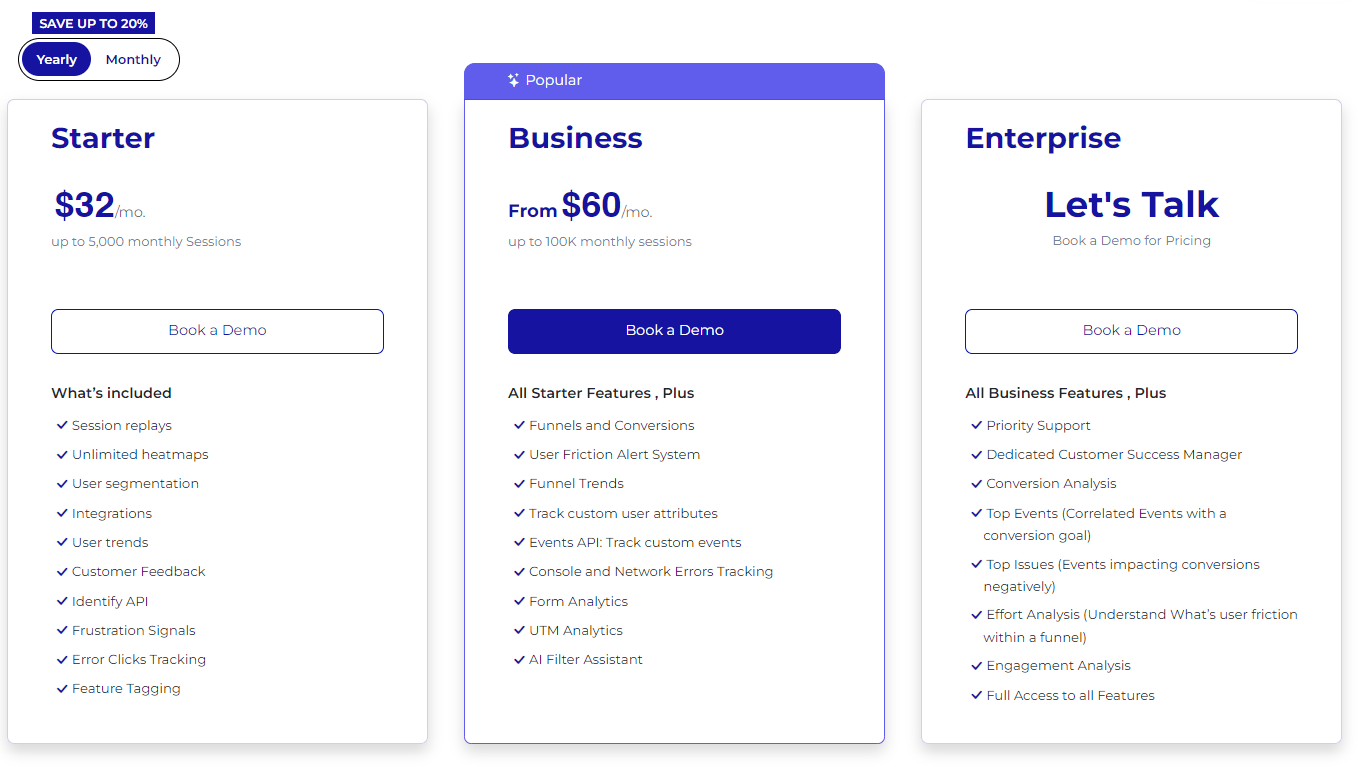
The FullSession platform offers a 14-day free trial. It provides two paid plans—Basic and Business. Here are more details on each plan.
- The Starter plan costs $39/month or $32/year and allows you to monitor up to 5,000 monthly sessions with up to 6 months of data storage.
- The Business plan costs $75/month or $60/year and helps you to track and analyze up to 100,000 monthly sessions with up to 12 months of data storage.
- The Enterprise plan has custom pricing and offers customizable sessions plus full access to all features.
FAQs About Web Design Feedback
How much feedback is too much?
While regular feedback is crucial, there's a fine line between being thorough and micromanaging. Aim for quality over quantity, and trust your team's expertise.
Should I use technical terms when giving feedback?
Use technical terms if you're comfortable with them, but don't feel pressured to. Clarity is key, whether that comes through technical jargon or plain language.
How can I ensure my feedback is constructive?
Focus on the issue, not the person. Use "I" statements to express how you feel about the design and suggest specific improvements.
Can I give feedback even if I don't have a design background?
Absolutely! Your perspective as a business owner or stakeholder is invaluable, especially when it comes to understanding your audience's needs and preferences.


